Download Analyzing and Visualizing Data with Microsoft Power BI.70-778.CertDumps.2018-07-06.25q.vcex
| Vendor: | Microsoft |
| Exam Code: | 70-778 |
| Exam Name: | Analyzing and Visualizing Data with Microsoft Power BI |
| Date: | Jul 06, 2018 |
| File Size: | 1 MB |
How to open VCEX files?
Files with VCEX extension can be opened by ProfExam Simulator.
Discount: 20%
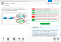

Demo Questions
Question 1
You use Power BI Desktop to create a visualization for a Microsoft SQL Server data source.
You need to ensure that you can use R visualization.
Which two actions should you perform? Each correct answer presents part of the solution.
NOTE: Each correct selection is worth one point.
- Download and install Microsoft R Server.
- Download and install RStudio Server on the computer that has Power BI Desktop installed.
- Install SQL Server R Services on the server that runs SQL Server.
- Enable R Scripting on the computer that has Power BI Desktop installed.
- Download and install Microsoft R on the computer that has Power BI Desktop installed.
Correct answer: E
Explanation:
References: https://docs.microsoft.com/en-us/power-bi/desktop-r-visuals References: https://docs.microsoft.com/en-us/power-bi/desktop-r-visuals
Question 2
You have a Power BI model that contains the following two tables:
- Sales(Sales_ID, sales_date, sales_amount, CustomerID)
- Customer(CustomerID, First_name, Last_name)
There is a relationship between Sales and Customer.
You need to create a measure to rank the customers based on their total sales amount.
Which DAX formula should you use?
- RANKX(ALL(Sales), SUMX(RELATEDTABLE(Customer), [Sales_amount]))
- TOPN(ALL(customer), SUMX(RELATEDTABLE(Sales), [Sales_amount]))
- RANKX(ALL(customer), SUMX(RELATEDTABLE(Sales), [Sales_amount]))
- RANK.EQ(Sales[sales_amount], Customer[CustomerID])
Correct answer: A
Explanation:
References: https://msdn.microsoft.com/query-bi/dax/rankx-function-dax References: https://msdn.microsoft.com/query-bi/dax/rankx-function-dax
Question 3
You have a Microsoft SharePoint Online site named Sales.
Your company has 1,000 sales users. All the sales users can access Sales.
You create a report in an app workspace in the Power BI service. You embed the report into a page on the Sales site by using the Power BI web part.
You need to ensure that all the sales users can view the report from the Sales site.
What should you do?
- Configure the Portal Site Connection for the Sales site.
- Enable anonymous access for the Sales site.
- Configure the app workspace for Premium capacity.
- Disable the Embed content in apps setting from the Tenant settings in Power BI.
Correct answer: C
Explanation:
References: https://docs.microsoft.com/en-us/power-bi/service-embed-report-spo References: https://docs.microsoft.com/en-us/power-bi/service-embed-report-spo
Question 4
You plan to deploy a Power BI app workspace that will be viewed by 10,000 users.
You need to ensure that dashboard data can be updated every 30 minutes.
What should you do?
- Assign each user a Power BI Pro license.
- Store the dataset in Microsoft Azure Storage that uses the Premium storage tier.
- Create the app workspace by using an account that is assigned a Power BI Pro license.
- Configure the app workspace for Premium capacity.
Correct answer: D
Explanation:
References: https://docs.microsoft.com/en-us/power-bi/service-premium References: https://docs.microsoft.com/en-us/power-bi/service-premium
Question 5
You have a Microsoft Excel 2016 workbook that has a Power Pivot model. The model contains the following tables:
- Product (Product_id, Product_Name)
- Sales (Order_id, Order_Date, Product_id, Salesperson_id, Sales_Amount)
- Salesperson (Salesperson_id, Salesperson_name, address)
The model has the following relationships:
- Sales to Product
- Sales to Salesperson
You create a new Power BI file and import the Power Pivot model.
You need to ensure that you can generate a report that displays the count of products sold by each salesperson.
What should you do before you create the report?
- Create a one-to-one relationship between Product and Salesperson.
- For each relationship, change the Cross filter direction to Both.
- For each relationship, change the Cardinality to One to one (1:1).
- Change a many-to-one relationship between Product and Salesperson.
Correct answer: B
Explanation:
References: https://docs.microsoft.com/en-us/power-bi/desktop-create-and-manage-relationships References: https://docs.microsoft.com/en-us/power-bi/desktop-create-and-manage-relationships
Question 6
You have a Power BI model that contains the following two tables:
- Sales (Sales_ID, DateID, sales_amount)
- Date(DateID, Date, Month, Week, Year)
The tables have a relationship.
You need to create a measure to calculate the sales for same period from the previous year.
Which DAX formula should you use?
- SUM(sales[sales_amount]) - CALCULATE(SUM(sales[sales_amount]), DATESYID('Date'[Date]))
- CALCULATE(SUM(sales[sales_amount]), SAMEPERIODLASTYEAR('Date'[Date]))
- SUM(sales[sales_amount]) – CALCULATE(SUM(sales[sales_amount]), SAMEPERIODLASTYEAR('Date'[Date]))
- CALCULATEx(SUM(sales(sales_amount]), DATESYID('Date'[Date]))
Correct answer: C
Explanation:
References:https://msdn.microsoft.com/en-us/library/ee634825.aspxhttps://docs.microsoft.com/en-us/power-bi/desktop-quickstart-learn-dax-basicshttps://msdn.microsoft.com/en-us/library/ee634972.aspx References:
https://msdn.microsoft.com/en-us/library/ee634825.aspx
https://docs.microsoft.com/en-us/power-bi/desktop-quickstart-learn-dax-basics
https://msdn.microsoft.com/en-us/library/ee634972.aspx
Question 7
You plan to develop a Power BI report that has a bar chart to display the number of customers by location.
You have a table named Customer that has the following columns:
- CustomerID
- CustomerName
- Address
- City
- ProvState
- Country
You need to allow users to drill down by location. The report will display the number of each customer by Country, and drill down to ProvState, and then to City.
How should you configure the drill down in the bar chart?
- In the Legend field, add Country. In the Axis field, add ProvState at the top, followed by City.
- In the Value field, add Country at the top, followed by ProvState, and then City.
- In the Value field, add Country. In the Legend field, add ProvState at the top, followed by City.
- In the Axis field, add Country at the top, followed by ProvState, and then City.
Correct answer: D
Explanation:
References:https://docs.microsoft.com/en-us/power-bi/guided-learning/visualizations#step-18https://docs.microsoft.com/en-us/power-bi/power-bi-visualization-drill-down References:
https://docs.microsoft.com/en-us/power-bi/guided-learning/visualizations#step-18
https://docs.microsoft.com/en-us/power-bi/power-bi-visualization-drill-down
Question 8
You have a table named Sales that contains sales data for the United States. A sample of the data in Sales is shown in the following table.

When you attempt to create a map that shows SalesAmount by Zone, you discover that the map shows a bubble based on cities instead of states.
You need to ensure that the map shows bubbles based on states.
What should you do?
- Add a column named Country that contains United States as the value.
- Add a column for longitude and a column for latitude.
- Select the Zone field. From the Modeling tab, change the Data Category.
- Select the Zone field. From the Modeling tab, change the Data Type.
Correct answer: C
Explanation:
References: https://docs.microsoft.com/en-us/power-bi/guided-learning/visualizations#step-5 References: https://docs.microsoft.com/en-us/power-bi/guided-learning/visualizations#step-5
Question 9
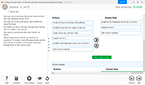
You have two tables named CustomerVisits and Date in a Power BI model.
You create a measure to calculate the number of customer visits. You use the measure in the report shown in the exhibit. (Click the Exhibit button.)

You discover that the total number of customer visits was 60,000, and that there were only 5,000 customer visits in August.
You need to fix the report to display the correct data for each month.
What should you do?
- Modify the measure to use the CALCULATE DAX function.
- Create a relationship between the CustomerVisits table and the Date table.
- Modify the measure to use the sum DAX function.
- Create a hierarchy in the Date table.
Correct answer: B
Explanation:
References:https://docs.microsoft.com/en-us/power-bi/desktop-create-and-manage-relationshipshttps://docs.microsoft.com/en-us/power-bi/desktop-tutorial-create-measures References:
https://docs.microsoft.com/en-us/power-bi/desktop-create-and-manage-relationships
https://docs.microsoft.com/en-us/power-bi/desktop-tutorial-create-measures
Question 10
You have the following tables.

There is a many-to-one relationship from Subscriber to Date that uses Subscriber[StartDate] and Date[Date]. The Cross filter direction of the relationship is set to Single.
You plan to create a column chart that displays the following two measures:
- Count of SubscriberID by Month based on the StartDate
- Count of SubscriberID by Month based on the EndDate
What should you do before you create the measures?
- Create an active one-to-one relationship from Subscriber[StartDate] to Date[Date].
- Change the Cross filter direction of the active relationship to Both.
- Change the active relationship for many-to-one.
- Create an inactive many-to-one relationship from Subscriber[StartDate] to Date[Date].
Correct answer: B
Explanation:
References: https://docs.microsoft.com/en-us/power-bi/desktop-create-and-manage-relationships References: https://docs.microsoft.com/en-us/power-bi/desktop-create-and-manage-relationships
HOW TO OPEN VCE FILES
Use VCE Exam Simulator to open VCE files
HOW TO OPEN VCEX AND EXAM FILES
Use ProfExam Simulator to open VCEX and EXAM files
ProfExam at a 20% markdown
You have the opportunity to purchase ProfExam at a 20% reduced price
Get Now!